
Designing for high-pressure decisions at scale
During Clearing, prospective students need to understand their options and act quickly, but fragmented information made the journey harder to navigate.
I shaped the initial centralised Clearing hub around students’ key decisions, then took primary ownership of phase two, using post-launch behaviour to refine the experience and create a more scalable content model.
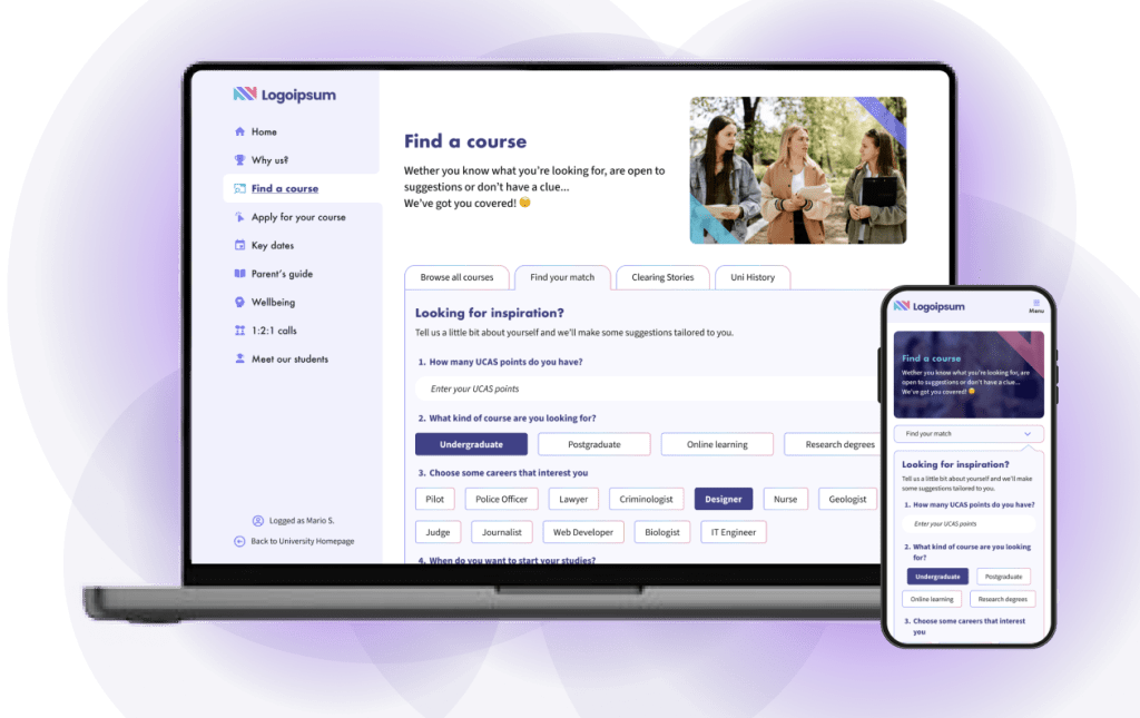

Clearing context
Clearing is a high-pressure period in the UK higher education journey, when prospective students need to find and secure a university place quickly. Information is often spread across course pages, application guidance and support content, making an already time-sensitive decision harder to navigate.
This case study presents an anonymised version of the project. As the original client designs are unavailable, the screens shown have been recreated using a neutral visual identity. My wider higher education experience includes work with LSBU, the University of Hertfordshire, LSE, Ulster University, Stanford University and Queen’s University Belfast.
My role
The initial challenge was to create a clearer, more coherent route through Clearing within existing technical and budget constraints. After launch, the focus expanded to refining the experience through real user behaviour and creating a content model that could scale more efficiently.
A fragmented journey at a critical moment
A higher education institution partnered with Squiz to improve its Clearing application journey within existing technical and budget constraints.
The existing experience spread information across multiple pages and reflected internal priorities rather than student needs. Prospective students struggled to understand Clearing, know where to begin and identify what to do next, creating hesitation at critical decision points.
The challenge was to create a clearer, more coherent route through the process while remaining feasible to deliver and responding to the brief to “think differently”.
Understanding where students struggled
To understand the Clearing journey, I combined market and competitor analysis with existing discovery findings, including interviews with current students and alumni. Together, these sources identified where fragmented information and unclear guidance made decisions harder under pressure.

Market Analysis
Established the scale and urgency of Clearing, highlighting the need to help prospective students make quick, informed decisions.

Competitive Analysis
Found fragmented Clearing journeys across universities, with limited guidance from course selection to application.

User Interviews
Showed that students were unclear about how Clearing worked, where to begin and what information they needed to progress.

Defining the Problem
Students needed to make time-sensitive decisions, but the experience reflected internal content structures rather than their journey. Fragmented information and unclear next steps made it difficult to understand their options and move from exploration towards application. The opportunity was to bring essential content and actions into one coherent route while working within existing technical and budget constraints.
These insights were reinforced by wider sector data and quantified findings from the user research:

In 2022, 33,280 students secured university places through UCAS Clearing, a 30% increase on the previous year, illustrating the scale of the process.

Among the students interviewed, 76% felt frustrated by the lack of clear information available throughout the Clearing process.

77% felt the process lacked personalisation, leaving them isolated and uncertain that universities understood their needs.
Clearing in students’ words
“Clearing is quite frankly a horrible process. The phone lines are constantly busy. […] I eventually was put through with all the places taken.”
First-year law student
“This was one of the most stressful experiences of my life…”
First-year psychology student
Together, the findings revealed a consistent need for clearer information, greater reassurance and a more structured route from understanding Clearing to taking action.
Turning evidence into a guided Clearing journey
Workshops brought together the research findings and the institution’s knowledge of its existing experience. We explored what was working, where students encountered difficulty and which areas offered the greatest opportunity for improvement. This established a shared direction for a centralised Clearing hub.

Bringing together the interview findings and the client’s knowledge of key tasks and operational requirements, I developed user journeys that mapped what students needed to know, decide and do at each stage. These journeys defined the essential information required for the MVP and formed the basis of its lightweight information architecture.
I translated this foundation into wireframes for the central Clearing entry point and a more guided route into course discovery. Working with developers, I refined the structure within the project’s technical and budget constraints before moving into interface design.
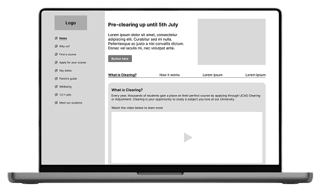
Centralised Clearing entry point
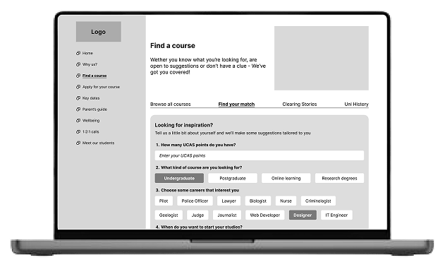
Guided Clearing course discovery
Key design decisions
The combined research and design process shaped three priority areas for the initial experience: explaining Clearing, helping students find relevant courses and enabling them to evaluate the university without leaving the journey.
Understanding Clearing
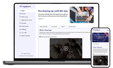
The homepage was designed as a single, central entry point for Clearing, addressing the initial lack of guidance. By reducing the need to navigate multiple pages, it improved early engagement and helped users quickly understand where to start.
Clearing course finder
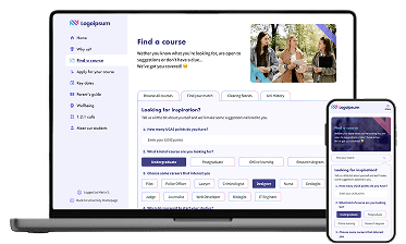
A dedicated course finder streamlined discovery by focusing only on available Clearing options. This removed irrelevant choices, reduced confusion, and enabled quicker, more confident decisions.
Keeping users in the journey
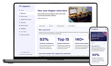
Integrating “About the university” content into the hub removed the need to leave the journey, helping users stay focused and maintain momentum throughout the decision-making process.
Together, these decisions established the initial experience and created a foundation for further iteration using post-launch behavioural evidence.
Scaling the experience in phase two
In phase two, I expanded the initial hub into a more scalable content model. I designed reusable components and a standardised course-page template that could be adapted across priority subjects, helping the client publish consistent pages more efficiently and manage future content with greater autonomy.
Measuring post-launch impact
The 2025 Clearing campaign provided an opportunity to assess how prospective students used the expanded experience during peak demand. Analytics from the week of results day showed increases in reach and interaction across the Clearing content.

Clearing-related page views increased by 30% week on week.

Interactions increased by 32% year on year, including 29% more scrolls and 42% more clicks.

Organic traffic increased by 12% during the Clearing campaign.
Together, these metrics showed that more prospective students reached and actively engaged with Clearing content during the peak period. Increased clicking and scrolling also suggested deeper exploration of the experience.
The flexible component model gave the content team more ways to present guidance, including richer formats such as video, while maintaining consistency across course pages.
Experience improvements in phase two
Alongside the reusable course template, phase two introduced three changes intended to make Clearing content easier to engage with, more reassuring and better suited to mobile use.
Richer content formats
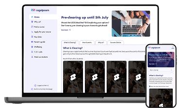
Video content ( like YouTube Shorts), presented key information in a more digestible format, particularly during high-pressure moments.
Social proof
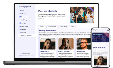
Student testimonials added reassurance and social proof to support more confident decision-making.
Mobile-first experience
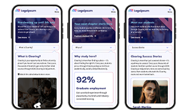
A more visual, mobile-first approach made key Clearing content easier to scan on smaller screens, which accounted for a significant share of traffic.
The increases in page views, interactions and organic traffic coincided with these changes, suggesting stronger engagement across the Clearing experience.
Student feedback
Although formal testing during the Clearing period was limited, feedback from current and prospective students provided further context on how the experience was perceived.

Clearer information
Students said the visual presentation, video content and structured content blocks made key information easier to understand.

Greater preparedness
Students reported feeling better prepared ahead of results day after exploring courses and next steps in advance.
Behavioural data and heatmaps also showed stronger interaction with primary calls to action and more consistent engagement across key content areas. Compared with the previous experience, users moved more frequently towards course search, application and sign-up actions.
Reflection
This project reinforced how critical structure and guidance are when users are making high-pressure, time-sensitive decisions. The initial hub brought fragmented information into a more coherent journey, while post-launch behaviour revealed where the experience still needed further support and refinement.
Working within technical, time and budget constraints required prioritising the most important user needs and identifying solutions that were feasible to deliver. It also reinforced that validation does not stop at launch: analytics, heatmaps and student feedback provided further evidence of where content and interactions could be improved.
Phase two broadened my focus from designing a single journey to creating a more scalable content model. Reusable components and structured templates supported greater consistency, more efficient rollout and increased autonomy for the client’s content team.
If revisiting the project, I would define clearer success measures and comparison baselines before launch, making it easier to assess the impact of individual changes. Overall, the experience strengthened my approach to balancing immediate user needs, behavioural evidence, technical feasibility and future growth.

