
Reframing a tax platform around user intent
As untied expanded, its website had to explain an increasingly complex product to people arriving with different tax needs and levels of confidence.
I led the end-to-end redesign, using research and behavioural evidence to restructure the experience around user intent, clarify key decisions and create a more scalable foundation for growth.
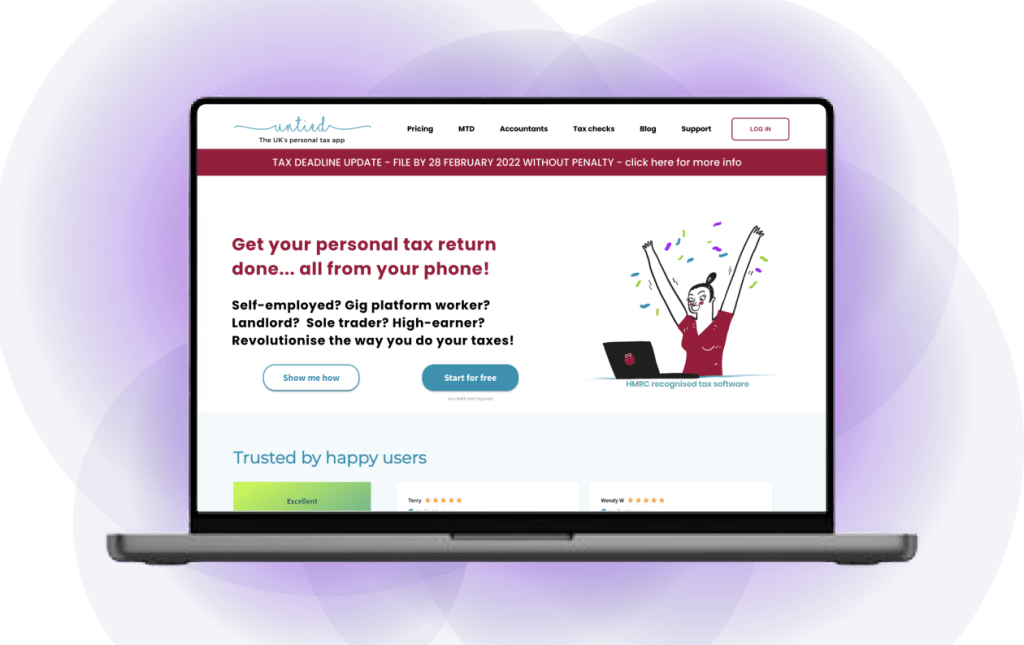

Meet untied
untied, the UK’s personal tax app, supports users across the full tax journey, from data collection to submission. As the product evolved, integrations across banks and partner platforms increased the complexity of the experience. The website needed to communicate a growing offer clearly and consistently while helping different audiences understand how untied could support their needs.
My role
I led the end-to-end website redesign, shaping its structure, interaction and visual design. This included defining a scalable foundation, aligning stakeholders and validating key decisions through research, testing and behavioural evidence. I also worked closely with developers through implementation, adapting the designs as product and technical requirements evolved.
Simplifying complexity
Managing taxes is already complex, and many users approached untied expecting the process to be difficult and time-consuming. Rather than reducing this uncertainty, parts of the website added friction through unclear terminology, fragmented flows and inconsistent messaging. Users struggled to understand where to begin, what information they needed and how different steps connected.
One user captured the problem clearly:
“This area feels overwhelming with all the tax-related terms and complicated stuff. I wish it could just be simpler.”
untied user
The challenge was to reduce cognitive load without oversimplifying the underlying tax process, giving users enough structure and guidance to understand their options and keep progressing with confidence.
Key issues identified
Through heuristic evaluation, competitor analysis, interviews and behavioural data, I identified three recurring sources of friction at key decision points.

Unclear product value
The hero failed to clearly communicate the product’s value, while calls to action directed users away from relevant content, leading to early drop-off.

Features lacked context
Key features were introduced without enough explanation, leaving users unsure why they mattered or how to progress. The journeys also lacked clear calls to action.

Plans were difficult to compare
The pricing structure relied heavily on jargon and lacked a clear hierarchy, making it difficult for users to compare options and select the right plan.
Together, these findings showed that the problem extended beyond individual pages. The website needed a clearer structure, more consistent guidance and messaging organised around users’ needs and decisions.
Key design decisions
I treated the three issues as connected parts of the experience rather than isolated page problems. The redesign focused on creating clearer entry points, explaining features in context and supporting more confident pricing decisions.
Restructuring the hero
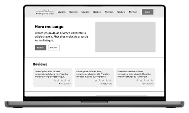
The hero was restructured around a clearer value proposition, with action-oriented calls to action providing direct routes into relevant content. Testimonials were brought forward to build trust earlier, addressing early drop-off and giving users a clearer starting point.
Clarifying feature value
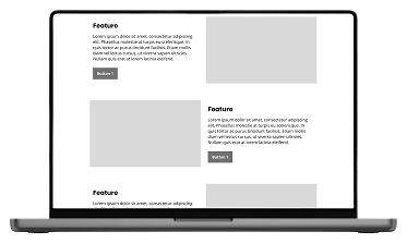
Complex features were broken down into concise, digestible explanations that connected their purpose to users’ needs. Clearer calls to action then guided users towards the appropriate next step, making the relationship between information and action more explicit.
Easier plan comparison
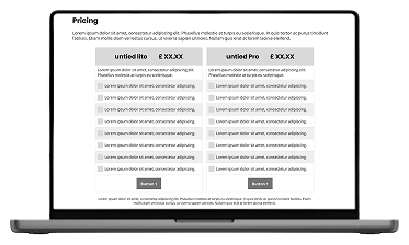
The pricing presentation was reorganised to reduce jargon and create a clearer visual hierarchy. Decision-critical information was prioritised so users could compare plans more easily, with clearer calls to action providing a more obvious route forward.
Structural foundation
Beyond the individual page changes, I restructured the site’s information architecture around users’ needs and key tasks, redefining the menu and content hierarchy to improve navigation and support future growth.
I also moved away from campaign-driven structures towards more consistent, reusable page templates. This gave the team a foundation for introducing new content and features without repeatedly redesigning the underlying structure
Brand system
Brand system
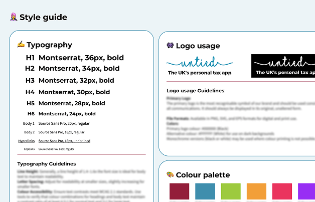
Alongside the structural work, I evolved untied’s visual language to create a more consistent and approachable experience. The original palette combined fluorescent green, dark teal and burgundy in pairings that did not consistently meet contrast requirements. I introduced lighter supporting tones for backgrounds and documented accessible colour combinations in the updated style guide, allowing the stronger brand colours to retain emphasis without compromising legibility.
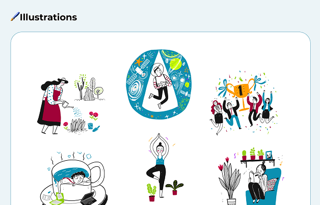
I also created a reusable set of custom illustrations, giving the team clearer guidance for applying the brand as the product and website continued to evolve.
Validating and refining the experience
Following launch, I used analytics and A/B tests to understand how different audiences responded to the revised journeys, messaging and calls to action.
Homepage analytics showed higher engagement after the hero was restructured, as its calls to action led into relevant on-site content rather than sending users immediately to the App Store or Google Play. Users were staying to explore more of the proposition before deciding whether to register.
Gig worker campaign
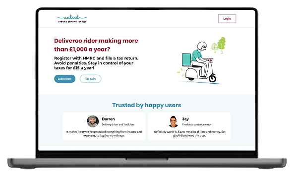
A/B testing showed that gig workers engaged more strongly with direct, action-oriented calls to action such as “Try for free.” This informed a shift away from generic messaging towards a clearer immediate action on the page.
Freelance hairdresser campaign
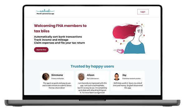
For freelance hairdressers, the task-focused call to action “Pay HMRC” performed more strongly than broader product-led language. This showed that messaging aligned with users’ immediate goals was more effective and informed more direct calls to action for this audience.
Reflection
This project reinforced that clarity does not come from a single design change. Content, information architecture, interaction and visual design needed to work as a coherent system so users could understand the product and know what to do next.
The A/B tests also demonstrated that clarity depends on context. Gig workers and freelance hairdressers responded differently to messaging, with direct, task-focused language performing more strongly when it reflected an audience’s immediate goal. This strengthened my approach of using behavioural evidence to refine an experience after launch rather than assuming one message would work for everyone.
If revisiting the project, I would test the navigation and content structure earlier, as this would expose ambiguity sooner and give subsequent design decisions a stronger foundation.

