
V&A Museum
Victoria and Albert Childhood Museum has as its mission to hold in trust the nation’s childhood collections. The V&A aims to be a worldwide leader when engaging with the younger generations’ culture and experiences.

The Client
Victoria and Albert Childhood Museum has as its mission to hold in trust the nation’s childhood collections. The V&A aims to be a worldwide leader when engaging with the younger generations’ culture and experiences.
My role
Right at the beginning of this project, my organisational skills came out, and I took the lead on scheduling all user interviews on a Google Sheet. I made sure that all the team had the same number of meetings, and the schedule didn’t clash with other activities. I began gathering the insights from interviews on an affinity map, having my colleagues join after. Then I worked on the user journey and structuring the platform on an app map.
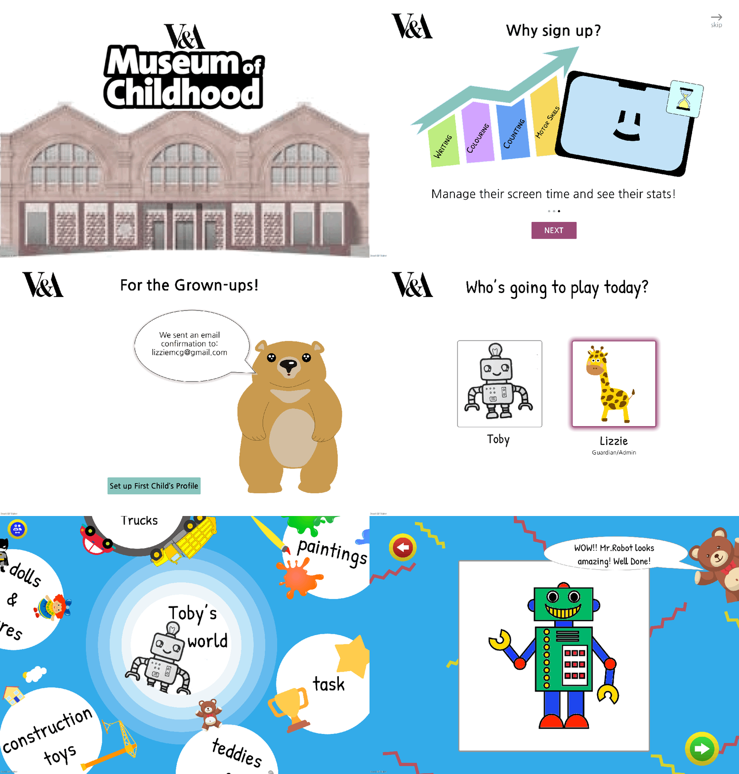
Additionally, I took on designing the app onboarding system, where I illustrated all the screens using Adobe Illustrator.
The Challenge
The V&A wants to continue to interact with its beloved community and to share its permanent collections in a didactic and engaging way.
The Solution
An app that reminds children to complete a daily activity, and where they can view and learn about the V&A permanent collections. The parents can monitor how long their child has used the product and see the progress made with each assignment.
The Process
My team and I adopted an agile methodology, using a Kanban board and daily morning stand-ups.
We kept all our work on Miro, an online whiteboard that we all had access to, including our Kanban board that we kept revisiting.
To reach the solution, we adopted the double diamond design process, expanding on user and market research, and then concentrating on the insights to define our problem statements. We diverged again while developing possible solutions that were distilled with user tests, which support us in finding our solution.
Takeaways
Throughout this project, I learned a lot about remote group work. It was vital for all to feel included and part of the team; we had morning stand-ups and afternoon de-briefs that encouraged us to know each other better.
As we were all students, we implemented daily roles, compensating for the lack of hierarchy. We respected the decisions made by that day’s facilitator and pushed each other to achieve more when necessary.
Designing for young children introduced new accessibility and interaction considerations, particularly around attention span, readability, and intuitive navigation. Neither my colleagues nor I interact with children daily, which resulted in designing unsuitable tasks. To improve in this area, we had to do research and talk with parents or child-carers, which turned out to be quite insightful. Due to young children’s small attention span, displaying smaller amounts of information was better, and the visual side needed to be highly engaging. Also, we had to keep in mind that young children can’t read, which pushed us to design a more intuitive platform.

