
Discovering value through onboarding
As untied grew in complexity, new users were not always discovering the features relevant to their tax journey or understanding what to do next.
I led the onboarding redesign, using behavioural evidence and step-by-step guidance to help users recognise the product’s value and progress towards key activation points with greater confidence.
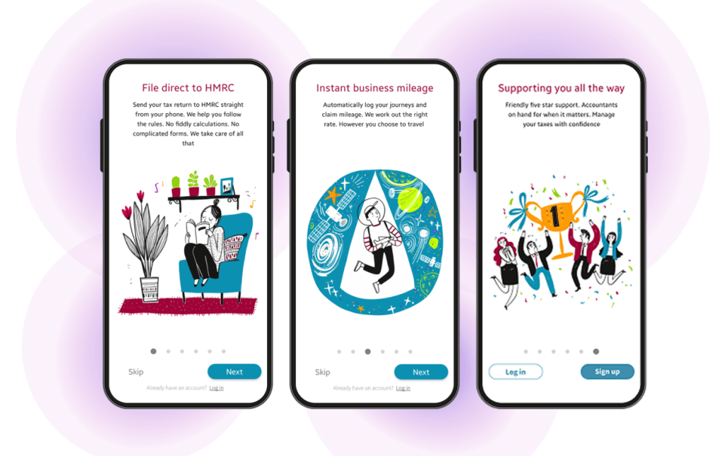

Meet untied
untied, the UK’s personal tax app, supports users across the full tax journey, from data collection to submission. As the product evolved, integrations across banks and partner platforms increased the complexity of the experience. The website needed to communicate a growing offer clearly and consistently while helping different audiences understand how untied could support their needs.
My role
I led the onboarding redesign from discovery through delivery, shaping how users were introduced to the product, discovered its core features and progressed towards key activation points. I combined behavioural data, research and testing to identify friction, align stakeholders around behavioural goals and refine the experience with developers through implementation.
Supporting different levels of confidence
As untied expanded its Pro offering, onboarding needed to introduce an increasingly complex product to users with very different levels of digital confidence. The existing experience did not explain the product’s value clearly enough or help users understand what to do next.
Some users were early adopters, while others described themselves as “technophobes”. The challenge was not simply to shorten onboarding, but to provide enough guidance and reassurance for less confident users without slowing down those who were ready to proceed.
The CEO summarised the intended shift:
“Doing taxes is already complex—the app needs to bring positive reinforcement!”
untied CEO
Research from the website redesign had already shown that many users viewed tax as inherently complicated. Onboarding therefore needed to do more than present information: it needed to introduce value step by step, acknowledge progress and make the next action clear.
Understanding where users struggled
To understand why onboarding was not supporting progression, I combined stakeholder discussions, interviews with current and prospective users, and behavioural data from the app.

Context from stakeholders
Stakeholders explained how the product had evolved and highlighted technical constraints, particularly around third-party integrations. These constraints shaped which steps were fixed and where onboarding could introduce additional guidance.

User research and behaviour
Interviews showed that users struggled to understand the features introduced during onboarding or why they mattered. Behavioural data reinforced this finding: users were skipping important steps and not reaching core features.

Defining the problem
The issue was not simply usability. Onboarding was not communicating the product’s value at the moment users needed it, leading to low feature engagement, increased reliance on support and failure to reach key activation points. The experience needed to make the purpose of each step, users’ progress and the next action clearer.
Designing support around users’ needs
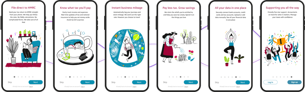
To make the product’s value and next steps clearer, I developed two connected parts of the onboarding experience: introductory screens and a personalised tax wizard. A third element, an in-app tutorial, emerged from subsequent user testing.
Onboarding screens
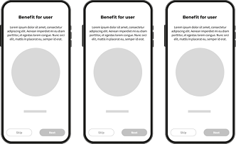
The onboarding screens introduced key features one at a time and connected each benefit to a clear next step. This gave users a more structured entry into the product without presenting everything at once.
Personalised tax wizard
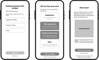
The tax wizard personalised the experience early by asking about the user’s situation and presenting the most relevant route. Visible progress helped users understand where they were and what would happen next.
In-app tutorial
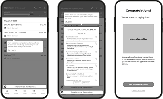
During testing, participants said they would value continued guidance after onboarding. In response, I designed an optional, step-by-step tutorial to support key tasks inside the app without requiring users to leave the experience.
I developed and tested wireframes for the introductory screens and personalised tax wizard, refining their sequence, content and guidance. Accessibility focused on supporting different levels of digital confidence, using manageable steps and clearly labelled actions to help users progress without slowing those ready to continue. When testing revealed a need for support beyond onboarding, I designed and tested the in-app tutorial.
Running this work alongside the website redesign aligned the experience with untied’s evolving visual system and created continuity between the website and app. Following validation, the onboarding and tutorial were launched in the live product.
Using metrics to evaluate impact
After launch, I combined product analytics from GA4 and Mixpanel with customer-support queries and user feedback to assess how the redesigned onboarding affected progression through the app.
Analytics showed more consistent progression through onboarding and fewer users skipping key steps. Users were also moving further into the product, indicating stronger early-stage activation.
The nature of customer-support queries also changed. Users asked fewer questions about navigating or understanding the product and more about their specific tax needs. This suggested that users could move through the app more independently and focus on their tax tasks.
What users told us
Post-launch reviews published across Reviews.io and app stores provided additional qualitative evidence of how users experienced the product. The comments below reflect themes of clarity, confidence and ease of use also seen in the behavioural data.
“So informative and personable! I was very worried about taxes and calculating, but they make it very easy and straightforward with the app/website and how it is broken down. […]”
Anonymous, untied user
“ This is by far the best UK-based app for self-employed I tried (and I’ve tried most). So good, in fact, that after using the Lite version to help build my Tax return, I upgraded to the Pro version. […]”
Will, untied user
“We were so worried about self assessment, but this app has taken all that stress away. Using the app is as easy as using any social media platforms. When I am not sure of which section to place a transaction, I email them through the app and, yes, they do respond. […]”
Anonymous, untied user
Reflection
This project reinforced that effective onboarding is not necessarily the shortest. Regardless of the number of steps, users needed to understand why each step mattered and what to do next. The experience also needed to provide additional support for people who were less confident with digital tools without slowing down those who were ready to continue.
The improvement in engagement came from aligning content, structure and interaction across the journey rather than relying on a single feature. Participants asking for a tutorial also showed that support could not end once onboarding was complete; some users needed continued guidance as they began using the product.
If developing the experience further, I would explore how the answers users provided in the tax wizard could support more personalised guidance throughout the product. Looking at aggregate behaviour across different tax situations could reveal where particular groups hesitated, skipped steps or needed more support, helping the experience surface more relevant information and actions.

